|
|
|

 A Roger Dean
Lecture
INTRODUCTION
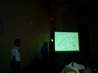
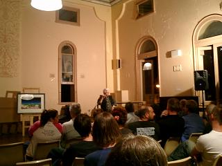
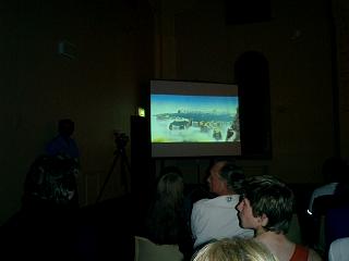
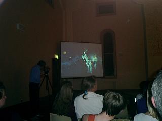
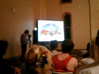
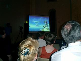
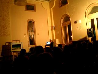
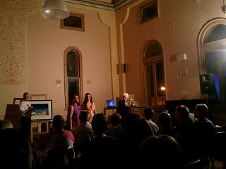
The Sunday Events page has details and photographs of the opening of Roger Dean's exhibition at the GIG Gallery in Glebe. Roger also gave a lecture about his work - complete with a computer-based slideshow - at Glebe Town Hall the following Thursday 25 September 2003. The lecture wasn't without drama - the slideshow broke down several times, and there were many 'couldn't quite get... the question out' type moments - but, over the course of almost 2.5 hours (the same length as the Yes concert) Roger was patient, informative and hospitable to an appreciative and dedicated group of around 100 fans.
The lecture was so informative, in fact, that it would be a shame not to note several sections - as they help both to clarify the processes of, and remove misconceptions about, Roger's art. The following notes come from a recording of the lecture - and, while I started off with rough translations, I ended up quoting him verbatim for the most part, since Roger's ideas are too articulate to generalise about. Much of the information - and almost all the photography - is presented out of order (but to proper effect) since, with the slideshow continually breaking down, Roger kept prompting for audience questions while trying to get it running again. This was the computer's fault - not Roger's.
 |
 |
 |
BACKGROUND AND TRAINING
I was originally recommended to go to art school, with the expectation of getting a job afterwards - though I didn't really know what people did there. I wanted to design bridges - my father was engineer in the Army, so that's where I thought going to art school would lead. I started with a group of around 100 people - much as in this room - painting nude-models (which was embarrassing - as I couldn't figure out whether to blankly stare, or glance quickly and work from memory).
About 3 weeks into the process, The Principal informed me I couldn't continue - as I'd done Maths and Physics. That - in his opinion - meant that I couldn't do Art. I was redirected into Industrial Design (which was OK - we still did nudes) - but the key to doing either of these things was learning to draw.
At art school, we did painting and drawing in regimented 45-minute classes - it was how we applied ourselves. But once, with an assignment to do, I became ill and was off with the flu for a week. I was sitting at home, with the radio on (it was an all-talk station - something interesting to listen all day), and started to draw - and didn't stop for around 10 hours. When I got back, my friends were amazed by what I'd done - and from this I learnt 3 things:
1. Contrary to what I was being taught at art school, "shut up, pay attention and concentrate of what you're doing" was actually the way to ruin a drawing. Let your mind explore elsewhere - let your subconscious take over. Inside us all, we all know what to do - the trick is to get that interfering part of mind out of way so you can just get on with the job.
2. Learning to draw - like learning to drive - takes time 'on the job'. Don't spread an 18 hour project over six months - if you can get it in one 18 hour day then do it; if you need another 18 hour day then do it. This was incredibly effective, and led to the third lesson:
3. Take your (conscious) mind off the job - this also involves the role of ego. And I was never too concerned with what my teachers thought of my work - but was deeply concerned what my peer group said. Peer group feedback is useful, positive - and great, so talk to people.
WORK ETHIC
The answer to "where do I get my ideas from?" is a combination: of inspiration and space in the mind. Landscape - and the pathways through it - has been my main inspiration. But inspiration is one thing; getting to use it is another - you need your mental space. I guess it's allowing all the things you know to work, but not to interfere with what you're doing.
There's a very good saying associated with Ken-Do (a sword-based Japanese martial arts that Roger has practised for many years) - it's about repetitive training. At the beginnning of any session, there's a few minutes of meditation - and there's a warm-up where you do endless repeated cuts with a sword. The process is tedious, but lesson that you learn is that you're training your body - and the thought behind it is that, if you can't train your body, your body can't train the mind. It's the body that's training the mind.
In drawing, you can think about what you're doing as much as you like - except when you're doing it. In doing it, you have to "act without thought". That's not the same as 'thoughtless action' - in fact it's quite the opposite. In the end it all comes down to the same thing: clear the mind, prepare so that at the time you can act without thought, then - in that space that you've created in the mind, together with the technique you've been practising - the process works.
 |
 |
 |
ARCHITECTURE AND HUMAN COMFORT
In my first year at the Royal College of Art, I had to look at what made people feel comfortable enough to sleep - research was difficult, but children seemed to have a much clearer idea about spaces - they know those spaces that cause anxiety and those that they liked. Their ideal spaces were things like tree-houses, caves, boats - but one child described the space as being such that he can feel in dark that there's nothing there, plus the entrance could be controlled - and so that he could be at eye-level with everyone else in room. So the upshot of that was "a hole in the wall" - which we built, and it was from this first experiment in the early 60's that we went on to all kinds of things, based on people's emotional reaction to space.
We have built a full-size house, but people don't live in it (it was for a touring exhibition only) - the method of construction was plaster with sprayed cement on the outside. There are strange acoustics within the circular/curving rooms - almost no transmission of sound from one room to the next, and strange anomalies - "acoustic lenses" - where it was like being in a giant sound-bubble. One more thing. We tried to do some of those "child's space" things for an adult, e.g. crawling through a hole in the wall to the bed and have that same feel - and found 3 or 4 clockwise approaching steps an ideal (I later found that the martial art of fortress-design echoes this - so that an attacking person is always off balance).
I was asked by an organisation called "Subud" to design what became Sydney's Darling Harbour. Both my brother Martin and I were paid for it - and my brother spent several months out here, working on it. I don't know what happened to it, but the cover painting for the "Classic Yes" album features the hotel I designed for the project - on the left is the hotel; on the right is apartments.
(FROM A PERSON IN THE AUDIENCE: I worked on it for Subud at the time. The proposal was put to the local government to develop this low-grade industrial area. The government said 'thanks very much' for the idea, then built almost an exact copy of an existing development called "Harbourside" in Boston, USA.) (Roger also revealed that the cover-painting for "Anderson Bruford Wakeman Howe" - 9 foot by 6 foot - was a design for an American resort.) We've also designed - not just houses and resorts - but sports arenas, cinemas, stages - all kinds of stuff.
Architecture isn't theatre, but it has to be inspirational. Architecture has to have people within the building first and foremost. Because the result is so huge for the environment, it has to work with the people around - and it must also designed in parallel with the interior.
ARTISTIC INFLUENCES
Q. Was psychedelia (artists and/or drugs) an influence on your work - as with other posters and album-covers of the time? A. Was there a psychedelic artistic influence - or was there a surrealist influence? Was I taking drugs at the time? The answer is 'no', 'no' and 'no'.
(Interestingly, though - but something I consciously didn't ask Roger about - he had once shared an apartment with Pink Floyd progenitor Syd Barrett)
Q. What others artists influenced you? A. Unfortunately I have to own up and say I guess there would have been a lot - alive now, or who worked in previous centuries. The problem was that, when I was learning, I didn't come across them. At the time, in my early years of art-school - when I was moving from art to industrial design - I hadn't come across the stuff that would blow my mind 10 years later. And by that time, I'd pretty much decided what I was going to do.
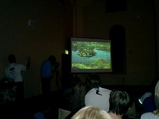
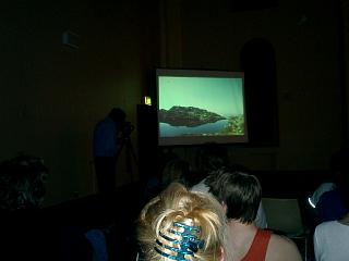
Q. What are the inspirations, particularly for your Yes artwork. It appears dreamlike - was it inspired by dreams? A. As far as I know, dreams having nothing to do with it. It was basically where I'd been and what I'd seen. In all the paintings, pretty much everything is real on some level. Everything is based on real-objects - all the trees and footpaths are real. I try to keep the fantasy element limited - not too much in one picture.
Q: Is there an Eastern or Japanese influence in your art? There are some Chinese postcards shown in "Views" - with the same feeling of calmness and serenity. A: Yes. I spent a lot of my childhood in Hong Kong - from just 12 to just before 15. I couldn't imagine a more influential time in my life.
 |
 |
 |
DRAWING, COLOURING AND (RE)PAINTING
Q. Do specific colours come in your mind when preparing final works - combinations that go well together? A. Where colours come from - very often an idea is based on one colour scheme, but very often it's not. Very often I've done a painting in one colour, then done another version in a completely different scheme. Occasionally the inspiration comes from nothing to do with art at all. At one point, a paint manufacturer wanted to pull its cadmium-yellow off market, as it was far too toxic. I was looking at a couple of tubes, but thought I'll do one painting before they go - this was the "YesYears" cover. It wasn't inspired by anything other than the fact that these colours would soon be off the market.
Q. Have many of your paintings been redone after they were finished? A. A lot of the paintings have been 'revisited'. I've been asked to include a lot things that I didn't want to do, so I've added them separately from the painting - trying new angles. I think half of paintings I've done have gone through several inspirations before I've left them alone. I have painted over them - sometimes I've done them again, but usually I paint over them.
Q. What about the girl in the Yessongs inner-painting? A. The girl was never in the painting - she was painted separately and added by the printers. But cat-paws were on the painting, as the cat walked across it - though I've since painted them out (Roger added later that this same cat had also 'peed' on the painting two weeks later, as it was standing by the wall - but he didn't get rid of the cat).
Q. On the craft of drawing: Photoshop (a computer-based graphics package) can 'make' artists who couldn't draw, as a lot of computer art is often made on a 'technical' basis. Will Photoshop be the 'starting point' for new artists? A: I don't think it will replace drawing. Traditionally, I know the difficulty of convincing a person of an idea with a sketch. We built our first piece of architecture to convince Brighton Council that a curving, non-linear hotel on the inside was possble. If Photoshop had been around then, who knows? The main thing is to communicate ideas - prior to building.
There are two messages beforehand: 1. Precise - the message to the builder - "Do This Do That. In the end, it will be built." 2. To clients - "This is the idea, what it will look like, feel like, be like - if we build it". Whatever it takes to communicate the idea most effectively is good. Nothing here (in the slideshow) was done on a computer - except the prints (logos for Yes and the Drangonfly) - where the inked design/sketches were scanned into a computer for re/colouring.
I worked with Kai - of "Kai's Power Tools" - on the cover for Steve Howe's "Turbulence". We used Photoshop before it was marketed. With his 'plug-ins', he was trying to allow some of the concepts that I did without painting. So, in one way, I'm not too enthusiastic about the concept of Photoshop - it makes make something difficult too easy.
Q. Do you use an airbrush (for the picture on slide)? All the time? A. Probably - when I was working quickly, to convey an idea rather than have a finished painting. I've used an airbrush on about a third of the paintings in the exhibition - though it looks like more, since I get the same patterning even with painting. The airbrush is used 2 ways: 1) for masking, and 2) to use it as a background, then paint over the top.
 |
 |
 |
THE PAINTINGS
Q. Do you have a favourite painting? A: I like those done with drawings as the primary tools, so from my drawing-period (with watercolour overlays): The "Asia Pyramid" (second 'Asia' album) and "Relayer" (by 'Yes').
But around that time, two things happened to me. First - I'd originally wanted my paintings to be a "window on a new world" - but had a change in attitude and wanted the painting to be a thing it itself: an object that you could touch and feel - so it had texture, depth and surface. Secondly, my eyesight starting getting worse - I needed a magnifying glass and glasses in order to paint the tiny, intricate details. It became just too tedious - so I moved to large paintings, and found that I really enjoyed it.
Of these new, larger paintings, I like the cover of the Yes "In A Word" box-set and the cover for Rick Wakeman's "Return To the Centre Of The Earth" album.
Q. Where are your original artworks normally kept? A. In galleries. The San Francisco Art Exchange. In New York, there are some paintings - no graphics - at the Grant Gallery, 7 Mason St; they've got 6 or 7 of my paintings on display at the moment. The original 'Yes' logo, as first used on "Tales From Topographic Oceans" - as I will tell anyone who will listen - is in the Victoria & Albert Museum. But it's not on permanent display - it hasn't been on display in years.
Q. How would the painting (and logo) for a Yes cover, for example, be chosen? A. While "Fragile" was still climbing the charts, I approached the band with the new logo I'd designed. They liked it and decided to use it for the "Close To The edge" album - and several more after that. But, there was very little collaboration in the paintings - with one exception, which I'll come to in a moment. Generally, I work alone. Yes kind of depended upon me to do my job and get it done. They wanted me to blow them away, but they didn't want to be distracted from creating an album.
(Some months earlier, Roger revealed to YESFANZ that he rarely had a chance to listen to the band's music prior to the record release - both were working to a deadline, though there may occasionally be discussions with the band over what they were trying to achieve - including the title for the album. The cover of "Fragile" was a good example of this).
The only exception to that was "Tales (From Topographic Oceans)". I shouldn't really tell you this story, but... we're celebrating 35 years of Yes and 30 years since they came here. That tour, 30 years ago started in Japan, and before the band went to Japan they were given a very strict talking-to: "When you're in Japan, you don't smoke dope. You smoke dope, you go to prison for 10 years". So it was a very strict rule - no smoking dope. And no-one did - everyone got the lecture. So what happened, I think the plane crew and their wives got together and made a big cake - and the cake got taken whole onto the aeroplane, and basically they divided it up. The flight was absolutely empty - there was no-one on the flight at all, I think there was maybe 20 on the flight and I think everybody got a piece of cake. In retrospect, one hopes the crew didn't - but they made it.
But it meant that, from London to Alaska nobody spoke - not a word was said. Everyone was staring into space. But from Alaska to Tokyo... I'd just been working on a project with a man called John Michell who wrote a book called "View Over Atlantis" - and he was very enthusiastic about Earth magic, patterns in the landscape, dragon-lines, ley-lines. And, as I said, I got to know him and from Alaska to Tokyo I decided that I had to tell Jon about it in incredible detail. So, bless him, Jon sat there looking stoned and staring out the window and I raved on for 9 hours about landscape, patterns in the landscape. Jon made his own contribution - when he recovered his wits, I guess. That is the nearest thing to a collaboration I can think of. (NOTE: Officially - at least - each band-member contributed to the "Tales" cover by suggesting a natural or man-made architectural feature, which was then incorporated into the final painting)
Most of my work is not commissioned. Sometimes (for many album covers), someone will say: "We'll have that".
Q. Do you sell many paintings? A. I find it very hard to sell my paintings - I sell about 3 a year.
 |
 |
 |
MISCELLANEOUS QUESTIONS
Q. (from me) There seems to be an influence of your work on the (distant future) architecture in the remake of HG Wells' "The Time Machine". Have you ever thought about, or actually been involved, in film-work featuring your architecture? A. I've been asked many times to work on films. Unfortunately, Hollywood seems to have an attitude: 'they've been screwed by the actors and screwed by the writers, so they're not going to be screwed by designers'. The offers I've received have been so ridiculous. Syd Mead - who is a good friend of mine, who designed the look of "Blade Runner" and "Tron" and many other films, - I've talked to him about this issue, and he's felt that, from his career perspective, it's been useful enough to work for a quarter of what his usual fee would be. I just felt that I wasn't going do that.
That doesn't mean to say that my work doesn't appear in movies. When they made the Star Wars movies, all my books were plastered all around the studio walls. You know, these were unpaid guest appearances. My brother worked with Stanley Kubrick on "A Clockwork Orange" - way, way back. Stanley had a whole load of my drawings of architecture - and I was quite intrigued when "Artificial Intelligence" came out, it was finished by someone else (Steven Spielberg) after his death, but to me it seemed like there was quite a lot of stuff that had been given to him back in 1969 for Clockwork Orange - (so it's) an issue for me.
I feel that, if my work is going to appear in films, I've got to find a different route in; maybe it must be different way - not being employed for 2 weeks to do concept stuff - which is the way it's been posed to me so far. To that end, I'm working with a production company now, which has got a number of films they're going to make. I'm working on one of those now - hopefully, you'll see it. But... I was actually offered by - I won't mention his name - he offered me 400 pounds a week for two weeks' work. It's ridiculous. I don't know what to say - I mean H.R. Giger, who did "Alien" - he's very bitter about it, and I thought I'm not going to be bitter about it.
Q. What is your favourite medium to work in? A. Concrete ceramics. My favourite paint is acrylic, because you can paint using semi-transparent glazes/layers - and because the colour is more stable than oils.
Q. Ever met Utzen - the designer of the Sydney Opera House? A. No. But it's brilliant, though - isn't it? It's amazing, breathtaking - and his use of ceramics is fabulous.
FOR MORE ROGER DEAN MATERIAL: see YESFANZ and The Sunday Events pages.
LINK
http://all-ez.com/newview1.htm - A 'condensation' of "The New View Over Atlantis", by John Michell (the updated book).
Introduction - Tour & Site News - Who's Who In Yes - The History Of Yes - YESFANZ Inc - Alex van Starrex -
Sebastian Hardie
F. A. Q. Section - 2003 Sydney Concert -
2003 Sunday Events -
A Roger Dean Lecture - Links & Comments
MY MAIN
WEB-SITE: http://homepages.ihug.com.au/~avanstar
EMAIL: avanstar@ihug.com.au
© Alex van Starrex